Chioco Design
After 21 years of shaping Austin and the surrounding areas through architecture, Chioco hired their first-ever marketing employee (me!). Now, I’m leading a full rebrand, rethinking how the firm looks, speaks, and shows up in the world.
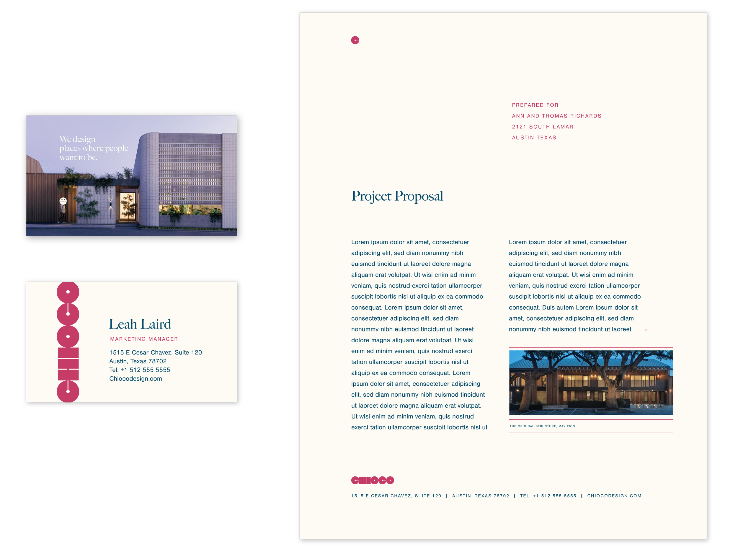
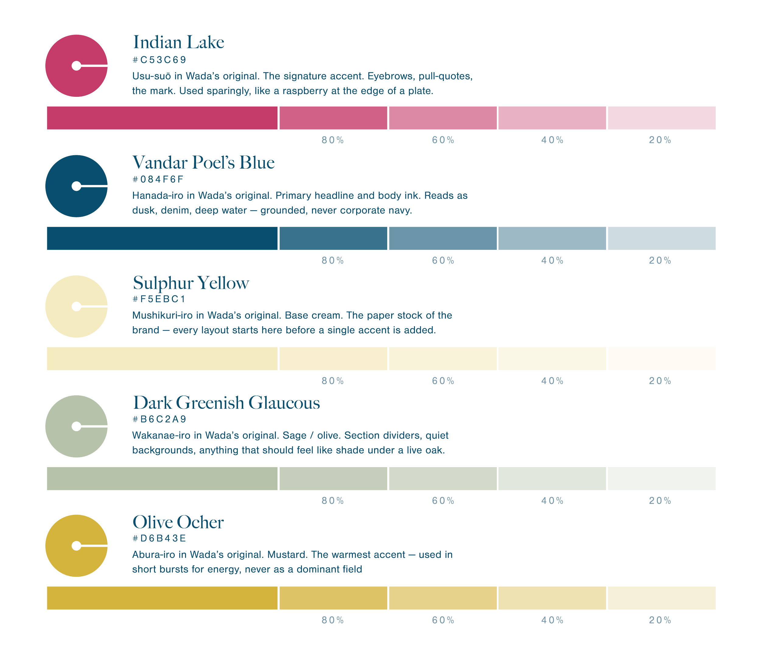
A palette borrowed from a century-old Japanese color guide.
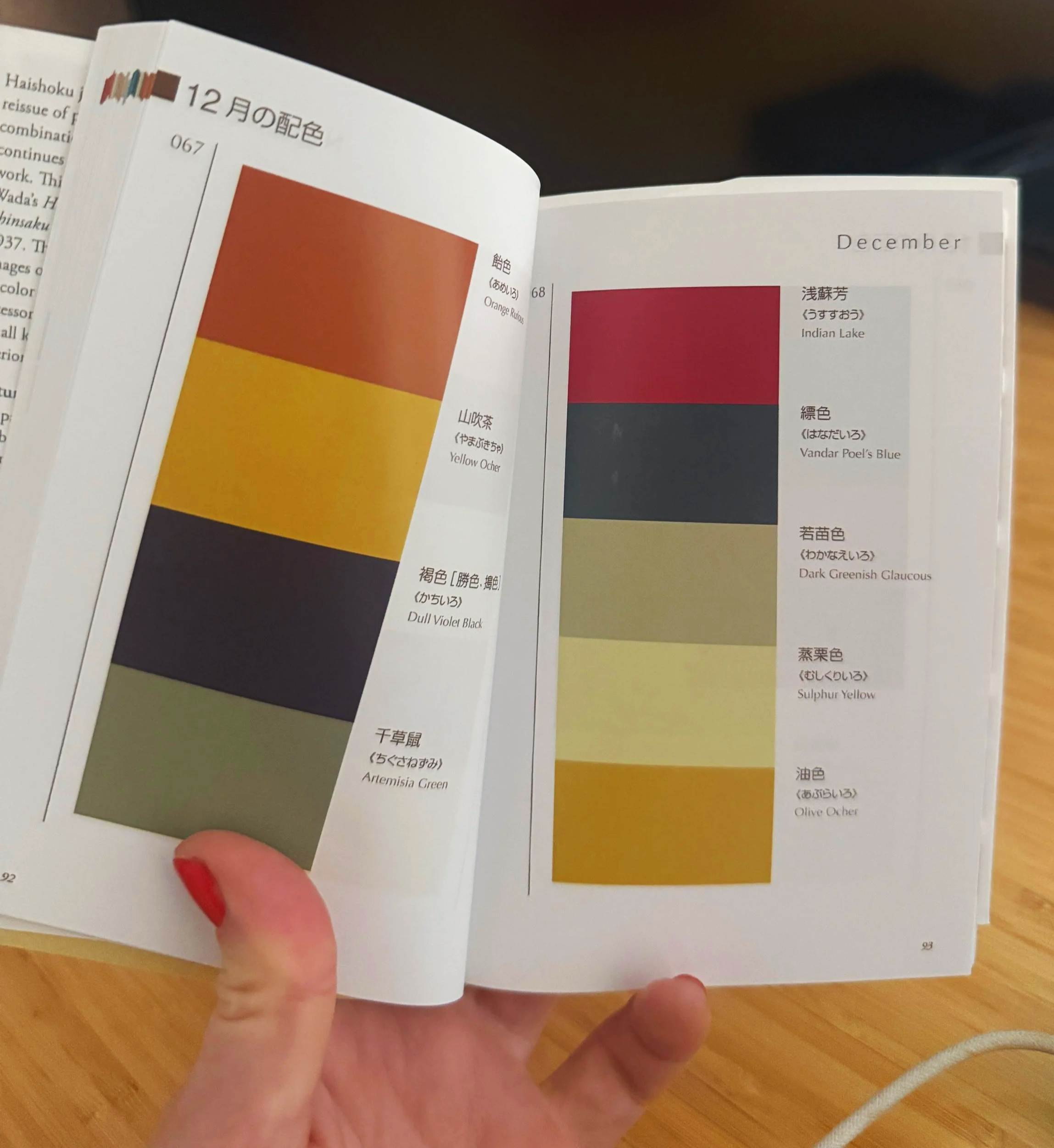
These five weren’t chosen one at a time. They’re lifted whole—as a set, in this order—from the December combination in Sanzo Wada’s Haishoku Jiten, a Japanese dictionary of color combinations, first compiled in the 1930s and still referenced by designers today for how deliberately its palettes are balanced. Cream is home base, the paper every story is told on. The other four are used the way Wada intended them: as a system.
Six letters, two shapes, one continuous line.

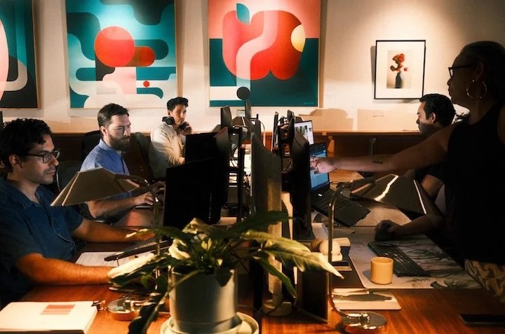
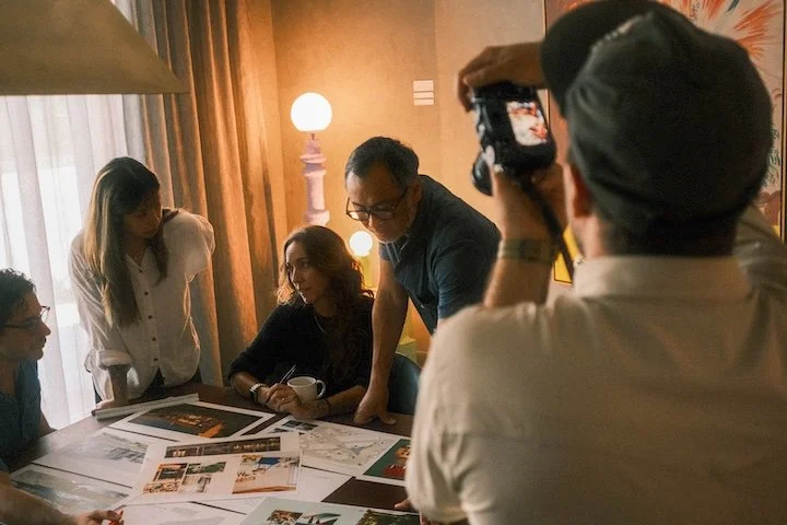
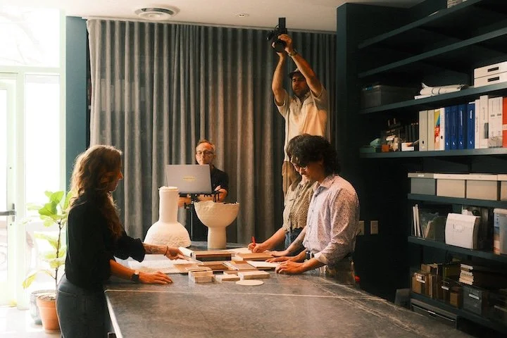
Photoshoot BTS